This rebranding for Just Eat began with a research phase focused on competitors, users, and brand positioning.
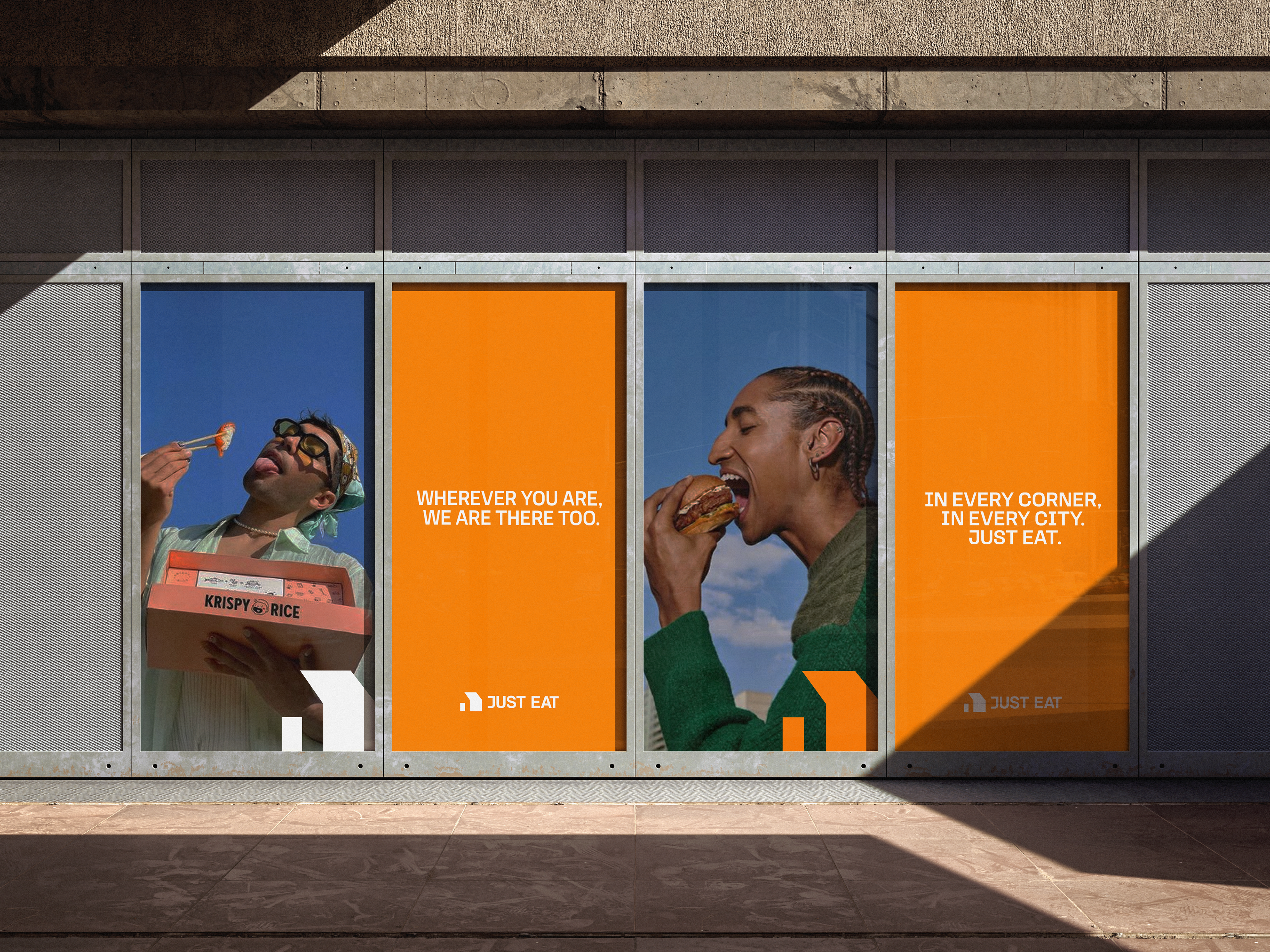
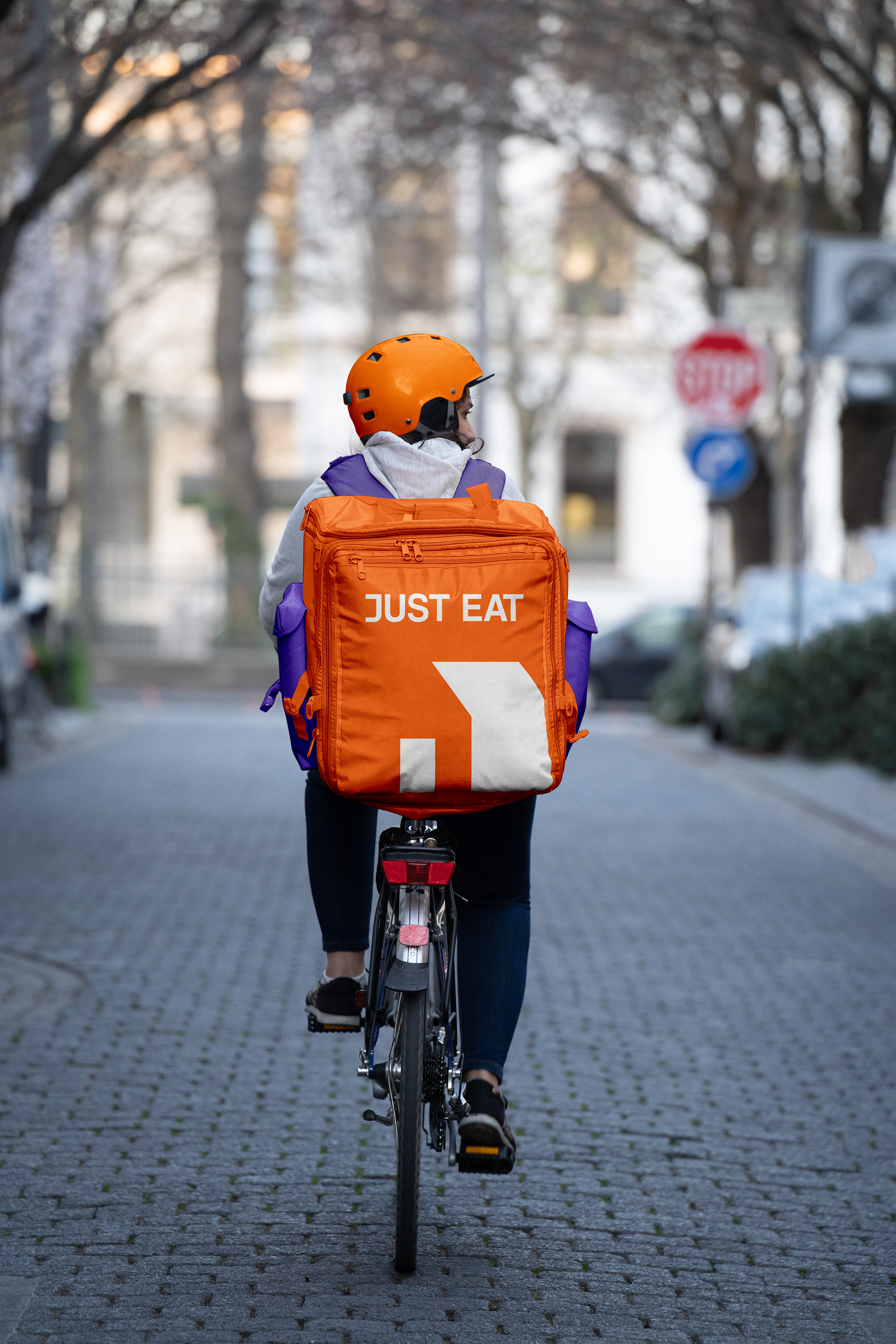
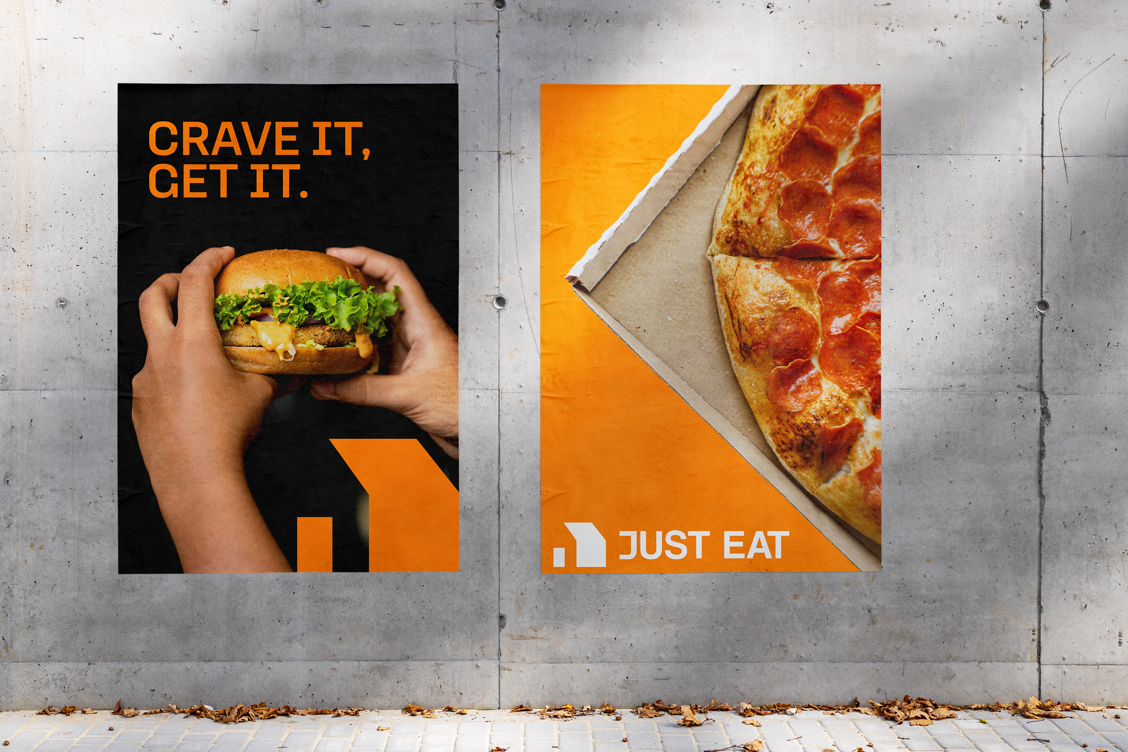
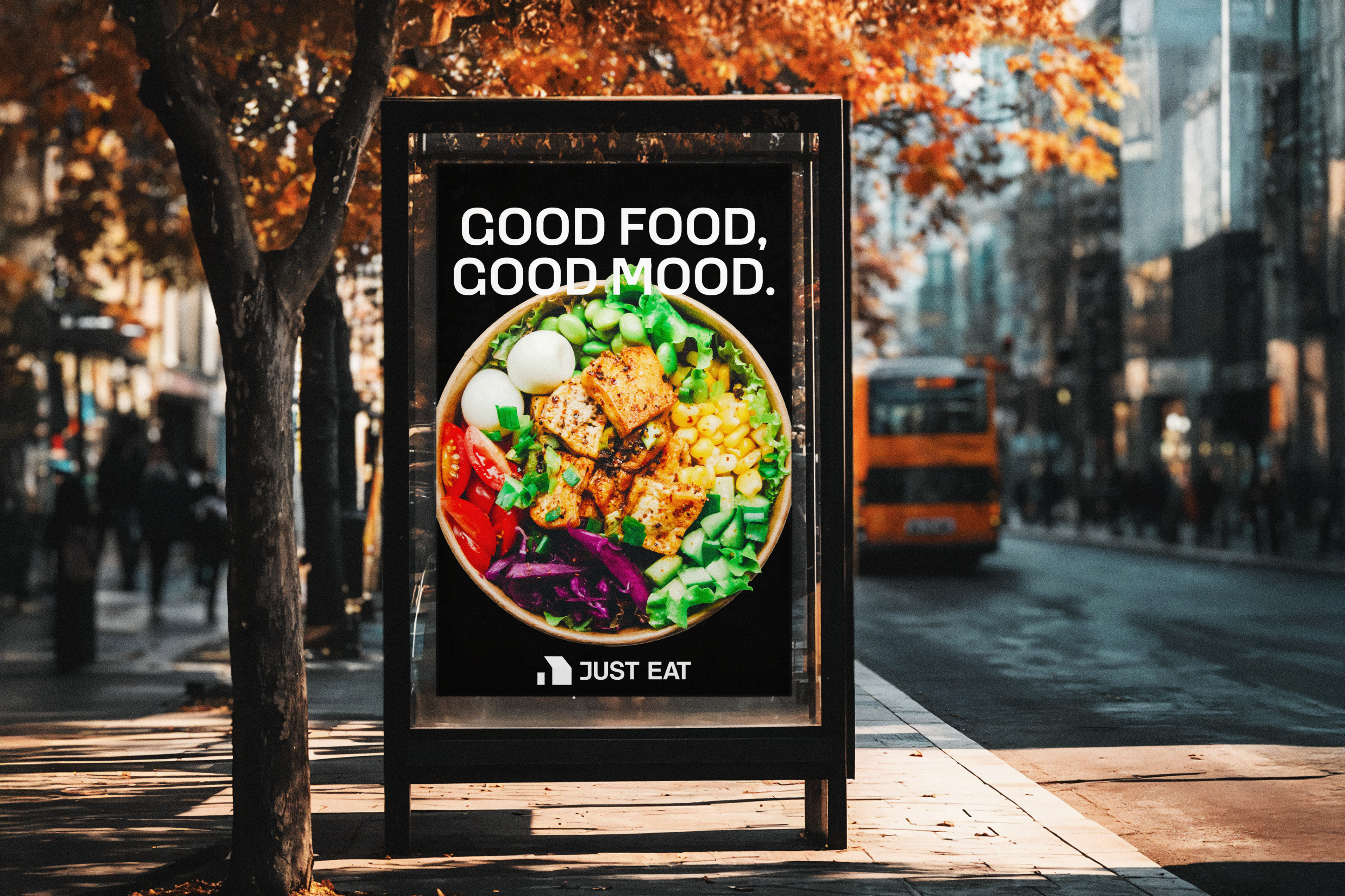
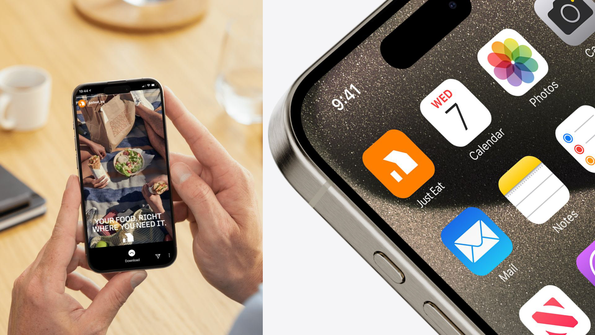
The new identity features a geometric house icon to emphasize home delivery, removing the cutlery as the brand has expanded beyond food. The vibrant orange was retained for its energy and accessibility, while a modern sans serif typeface with a custom “J” adds a distinctive and contemporary feel.
The new identity features a geometric house icon to emphasize home delivery, removing the cutlery as the brand has expanded beyond food. The vibrant orange was retained for its energy and accessibility, while a modern sans serif typeface with a custom “J” adds a distinctive and contemporary feel.
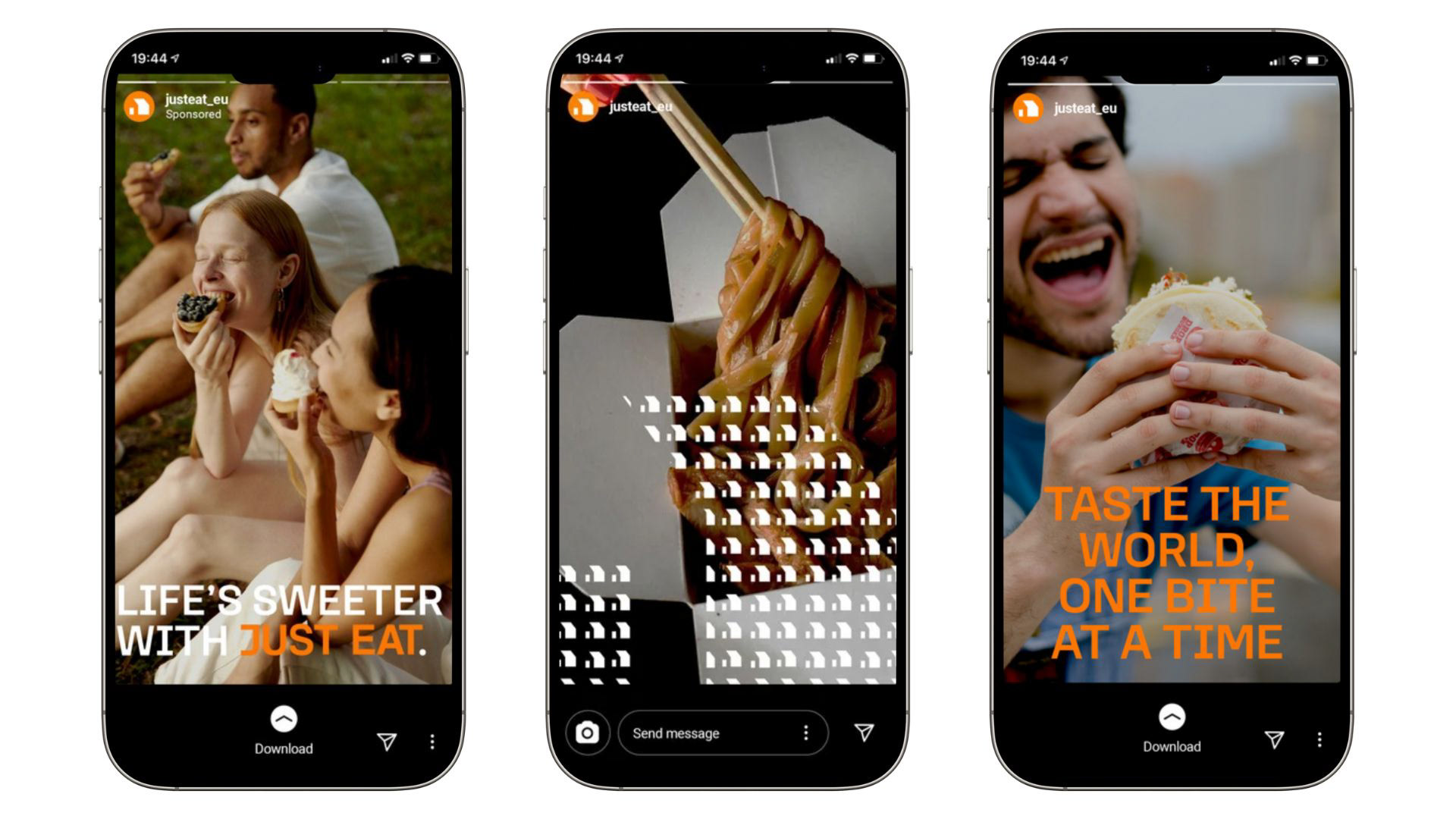
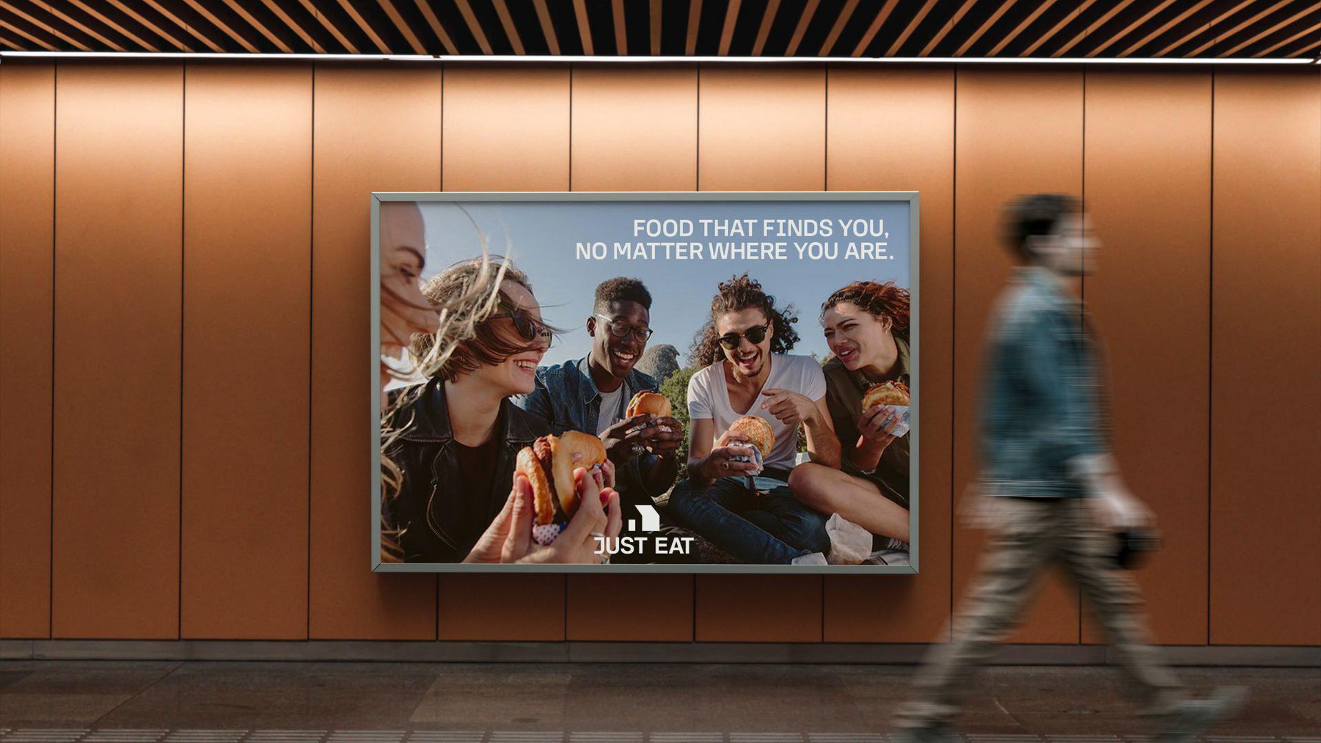
The tagline “Whenever, wherever, Just Eat” captures the brand’s accessible and adaptable spirit. Messaging such as “Wherever you are, we’ve got you covered” reinforces its presence as a reliable and international companion in everyday moments.
bau master's branding project | 2024