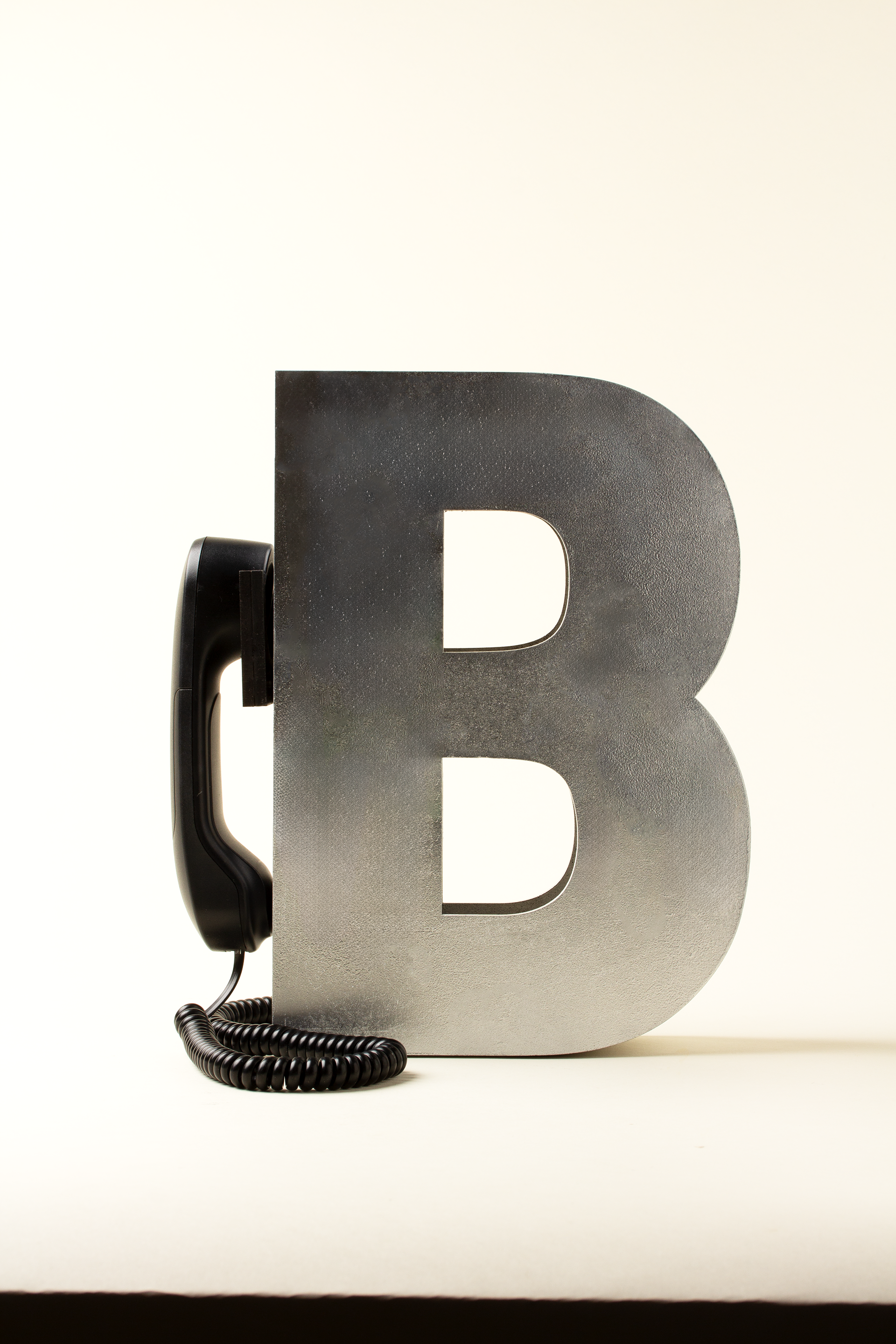
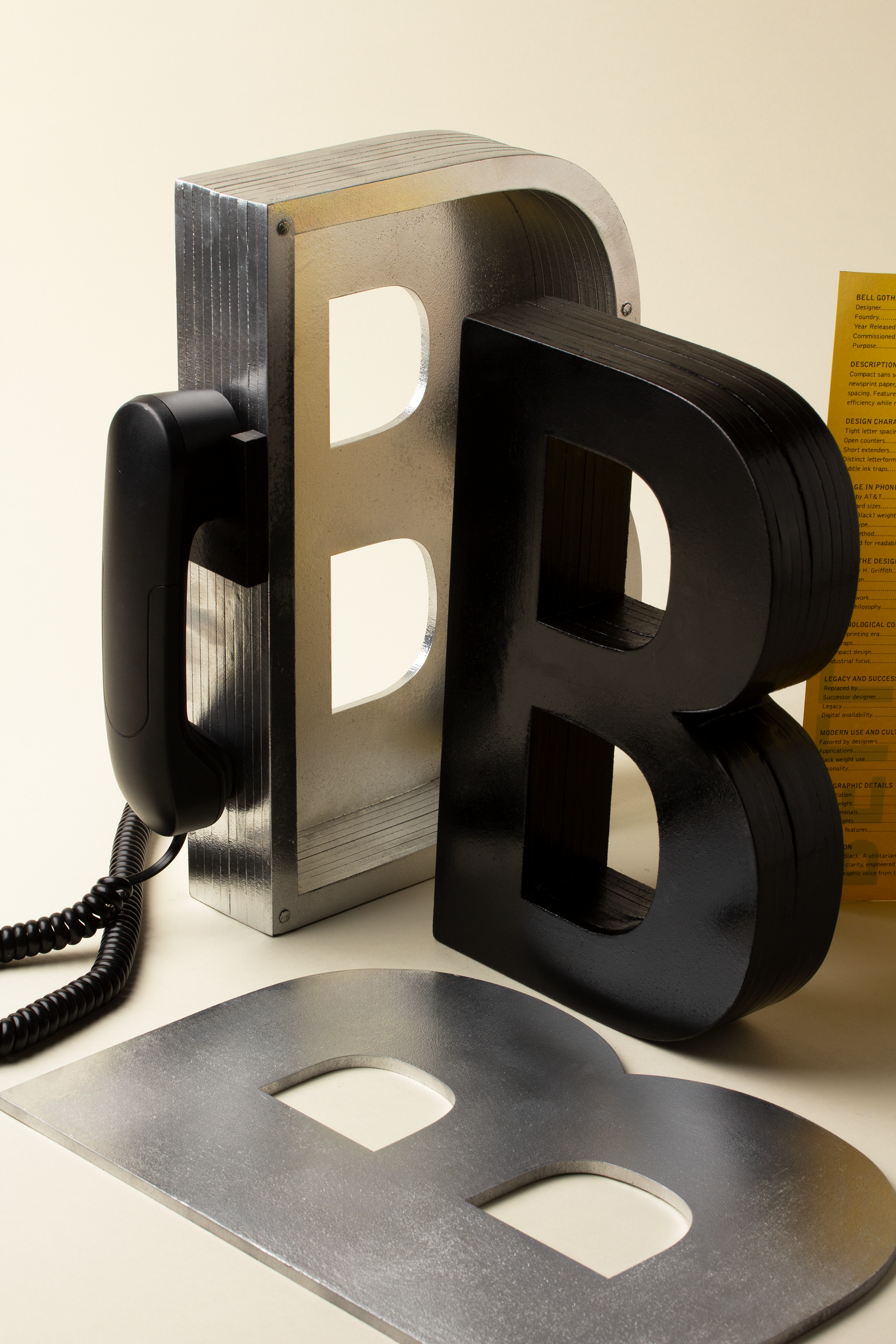
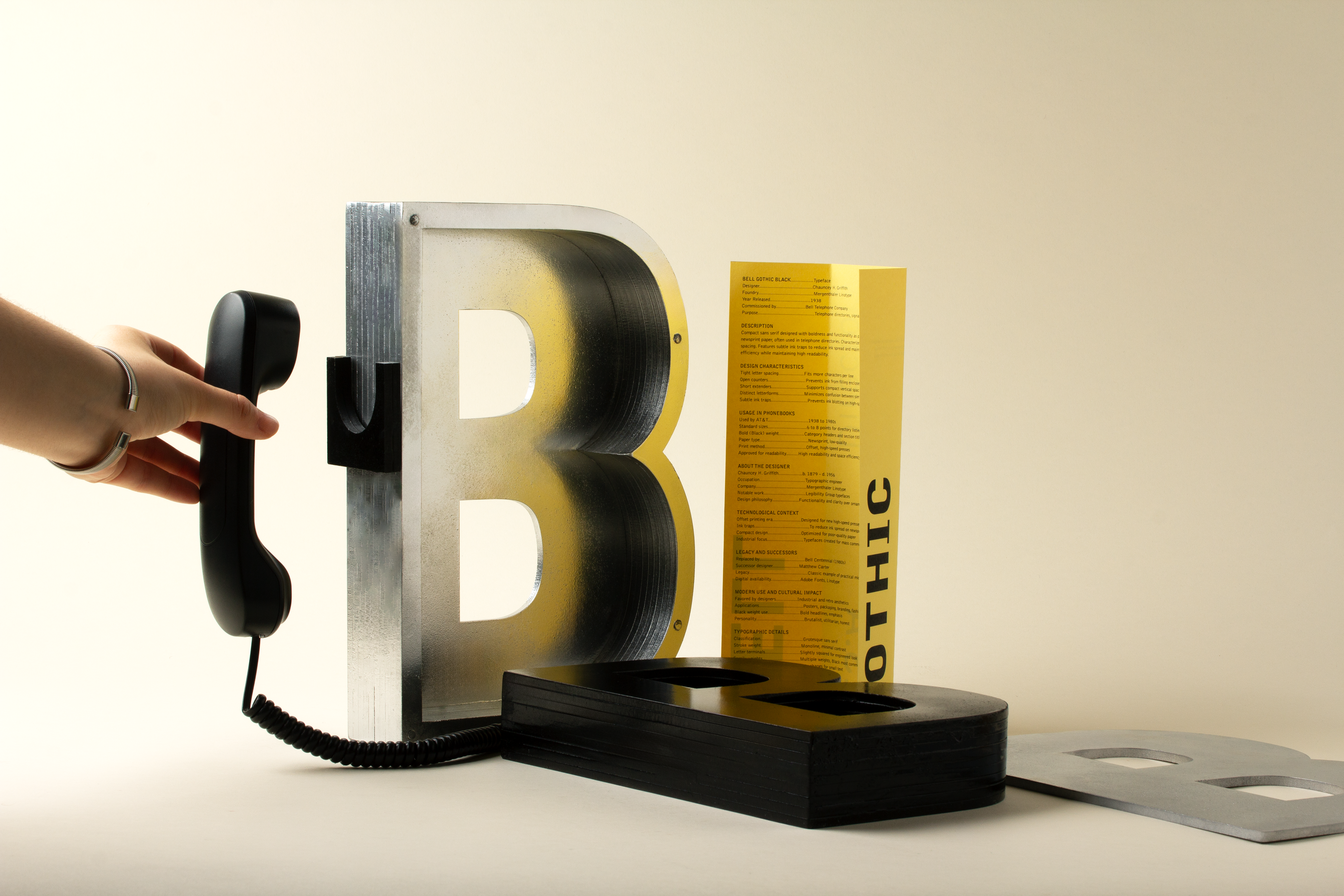
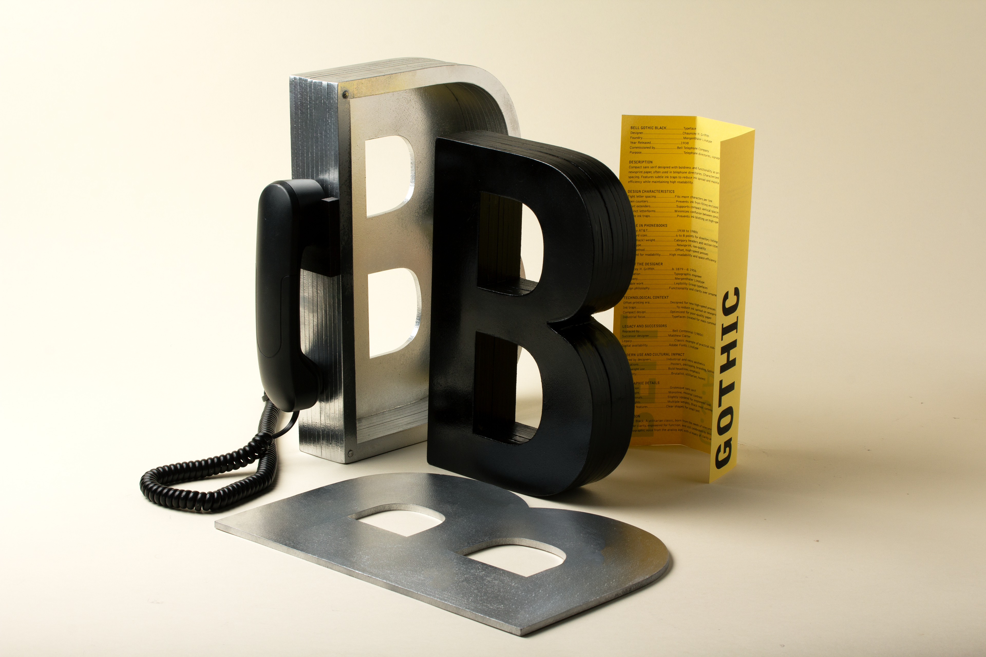
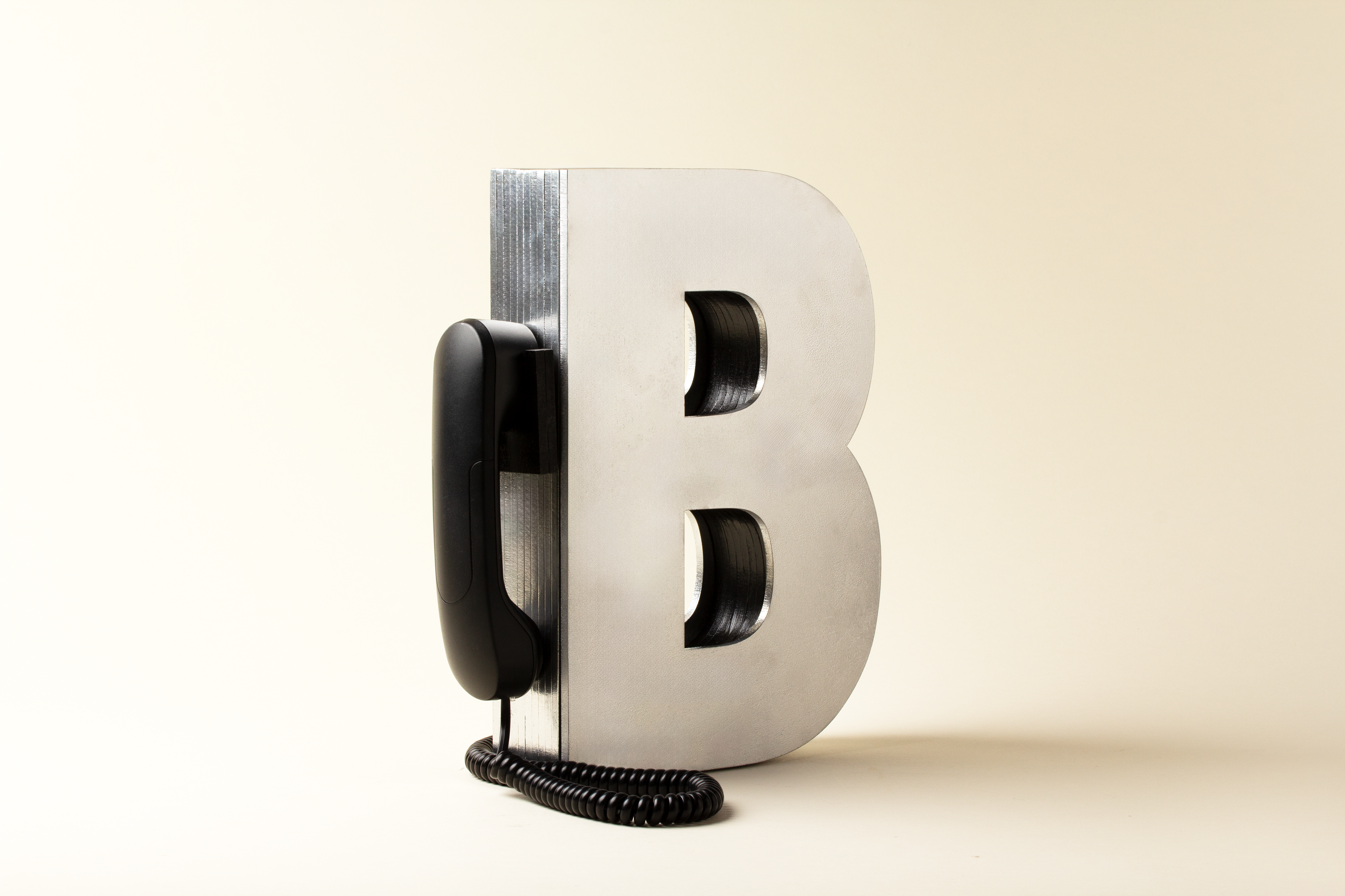
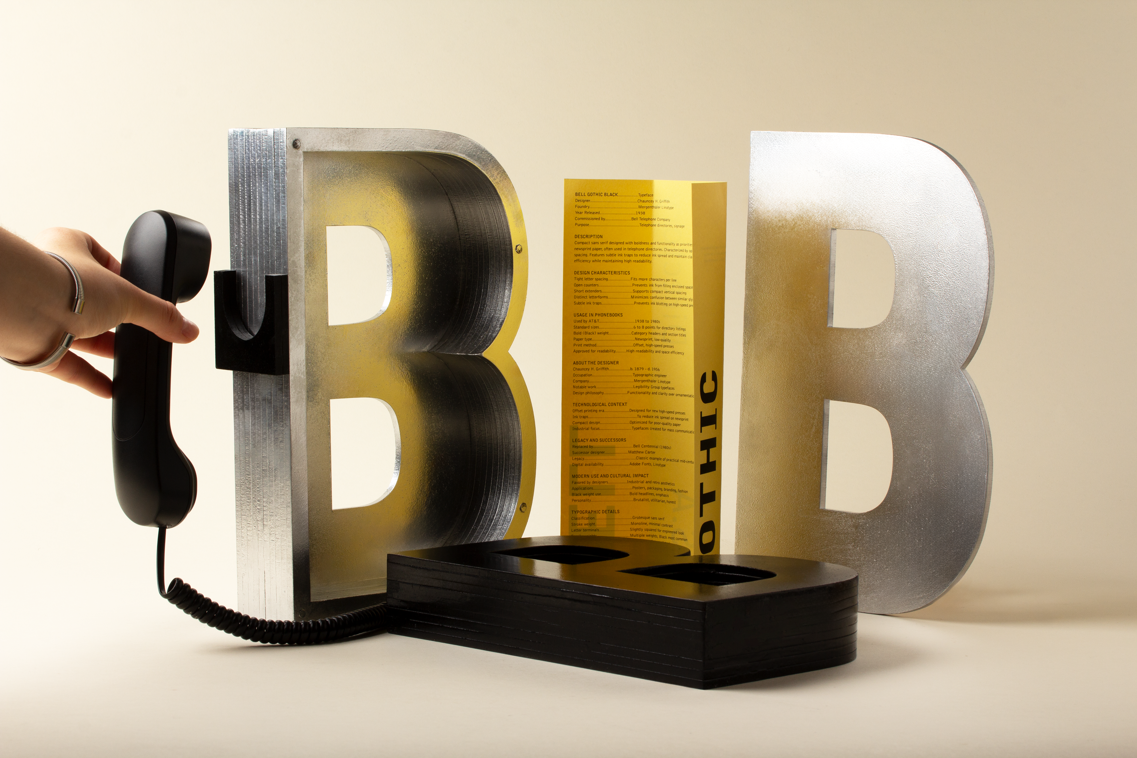
This project is a typographic homage to Bell Gothic, a sans serif typeface designed in 1938 by Chauncey H. Griffith for AT&T’s U.S. telephone directories. Known for its legibility and ink efficiency, Bell Gothic became a symbol of functional design.
I created an ergonomic packaging piece as a monument to the letter B, using laser cut MDF wood, sanded and spray painted for an industrial finish. Inspired by the phonebook context, the design integrates a telephone element and presents the information in a format that echoes its original use.
The result is a packaging object that highlights the typeface’s formal features while repositioning it as a piece worthy of tribute, both visually and historically.